 This poster was designed and created to advertise "BlueLine" to our primary audience. It was created using "Gimp" photo editing software at one of the group members houses. We picked the blue-black colour scheme for various reasons. Firstly, because the film is called "BlueLine" and so we thought blue would be appropriate, secondly because the black represents mystery, or something sinister. Also the "blood drop" shadow behind the text could reinforce the sinister effect. The four lines, one below "blue" and "line", and then others protruding from the words themselves, are symbolic of the train track that he travels down on his final journey out of his old life to start his new one, which is where the film would continue if it had been made into a feature-length film. The large blue "blood drop" effect, was to reinforce the fainter ones and give a bigger impact on the audience.
Monday, 2 May 2011
Poster for advertising BlueLine
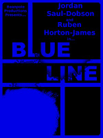
 This poster was designed and created to advertise "BlueLine" to our primary audience. It was created using "Gimp" photo editing software at one of the group members houses. We picked the blue-black colour scheme for various reasons. Firstly, because the film is called "BlueLine" and so we thought blue would be appropriate, secondly because the black represents mystery, or something sinister. Also the "blood drop" shadow behind the text could reinforce the sinister effect. The four lines, one below "blue" and "line", and then others protruding from the words themselves, are symbolic of the train track that he travels down on his final journey out of his old life to start his new one, which is where the film would continue if it had been made into a feature-length film. The large blue "blood drop" effect, was to reinforce the fainter ones and give a bigger impact on the audience.
Subscribe to:
Post Comments (Atom)
No comments:
Post a Comment